I thought similarly to @AlecM. Also, does your church have a motto or something simple that summarizes your beliefs? If I was church shopping, something like that would catch my attention. It could be something small below the AUMC. To balance it, you could put the full church name at the top and motto at the bottom.
8 Likes
Yes. “Serve God, love others.”
7 Likes
Mis clicked and landed in the free forum. I am now obsessed with AR1 and Robert28
I want to believe their interactions back and forth is an act.
10 Likes
Oh no, there are multiple years of threads of them going back and forth with each other ![]()
![]()
6 Likes
I feel like that should definitely be on there somewhere.
2 Likes
“Are not!”
“Are too!”
5 Likes
I’m dying ![]()
![]()
![]()
my god, I must be so important.
4 Likes
And engineers and physicians are not.
1 Like
Yeah, I can’t finish all that. Not really sure I can even tell what Robert is trying to say most of the time. I hate that fans of other schools might peruse the free boards and think that it’s representative of our fanbase.
Yikes.
1 Like
4 Likes
Not as important as me! ![]()
2 Likes
Haha that’s true! Though I do know a few folks with fellowships/assistantships that make more than some of my colleagues.
1 Like
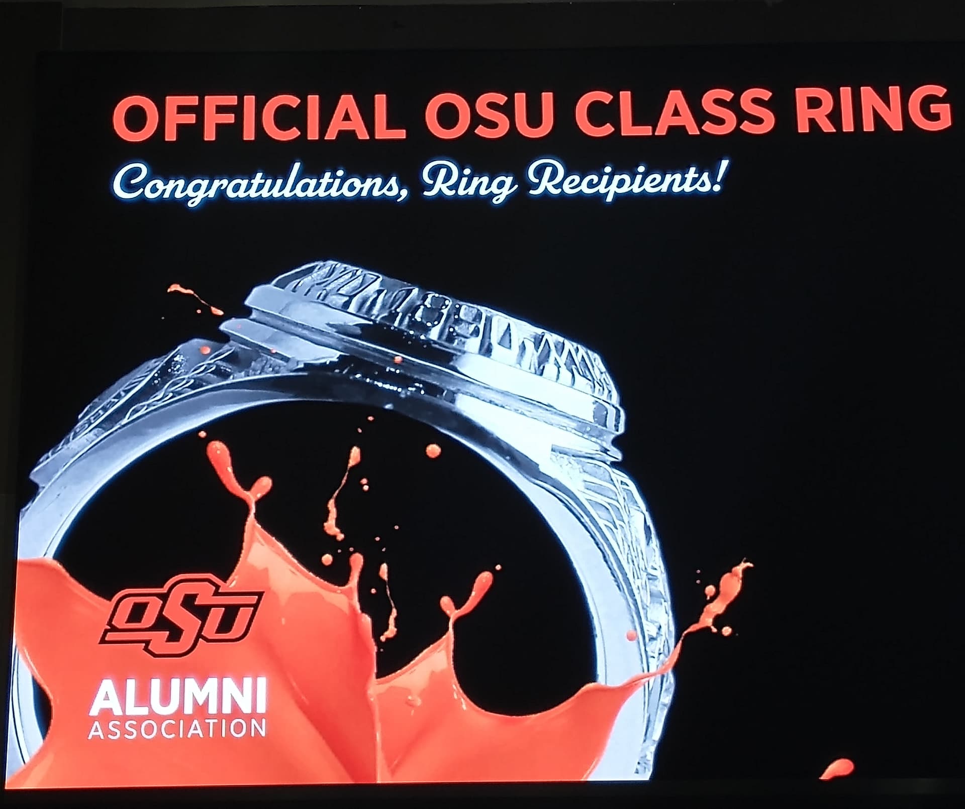
I admit I am not a graphic designer but I am fascinated by folks who are talented with logos. I like the simplestic nature of the flame logo. However, the flame to the left seemed a bit harsh and looks like something is on fire. I suppose you could argue “being on fire for God” (a positive connotation) but that flame looked a bit ominous … more like a hell-like fire than a light of the earth God fire ![]() Sorry, that sounds mean which it isn’t meant to be, but it when I saw the color/design that’s what I thought of…shame on me. Maybe if you changed the color to not be two-tone or to only use the orange color? The red color is what is making it look more harsh IMHO. And that’s not just because I’m a OkState fan, LOL
Sorry, that sounds mean which it isn’t meant to be, but it when I saw the color/design that’s what I thought of…shame on me. Maybe if you changed the color to not be two-tone or to only use the orange color? The red color is what is making it look more harsh IMHO. And that’s not just because I’m a OkState fan, LOL ![]()
1 Like
Can you imagine someone from Wisconsin stumbling across the free board and trying to decipher it. ![]()
6 Likes
Oh no, it’s supposed to be a modern take on the cross & flame of UMC.That flame represents the flame of Pentecost (when the apostles meet and the Holy Spirit appears as a flame over their heads & they speak in a multitude of languages, then they go share the good news all over the world.)
Our pastors are attached to the logo but also know we need to have a local brand.
But this is great feedback because it means if you aren’t familiar with UMC it can be weird. So thank you!!!
1 Like