Was actually kind of shocked there wasn’t a Uni thread already (Kill this if I missed it).
I was hating on ISU uniforms in the football 2019 thread, so I’ll move it here, but :
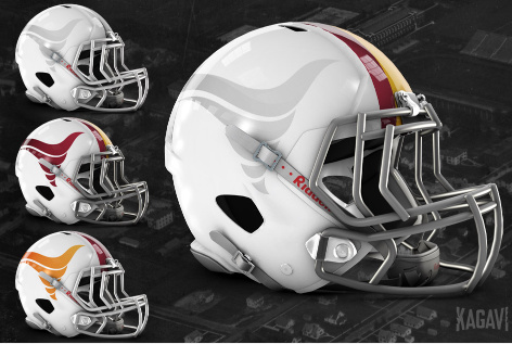
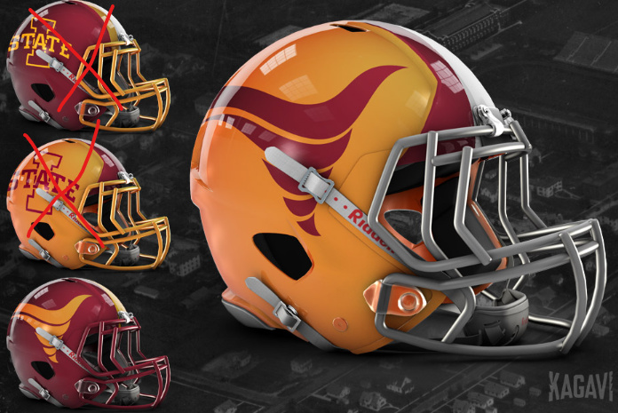
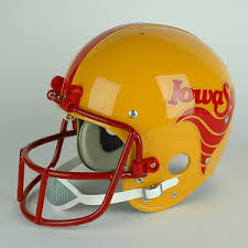
in doing my internet image search to bash ISU unis, I came across these…why on EARTH are these not their normal helmets? Simplistic, classy, streamlined…MUCH better.
Man, why did they have that logo so low? Misuse of helmet space has always bothered me. Looking at you New England Patriots with the logo almost at the top of the helmet.
Not sure if it works across all platforms, but the way I do it is copy the image in Chrome, then simply paste it in your text box here on the forum. I’m in Win 10.
Then you definitely shouldn’t have uniform that’s not a school color. Other than that I don’t mind their uniforms. The logo is boring but other than that not terrible to me.
As a uniform junkie, I think no school does throwback uniforms better than OSU. I think they’ve all been done in spectacular fashion, but where do you rank each sports’ OSU throwback uniform? These throwbacks come to mind to rank:
Football’s Homecoming 1988 throwback uniforms
Basketball’s cursive cowboys uniforms
Baseball’s 1959 throwback uniforms
Golf’s old-school swinging Pete logo on hats/polos